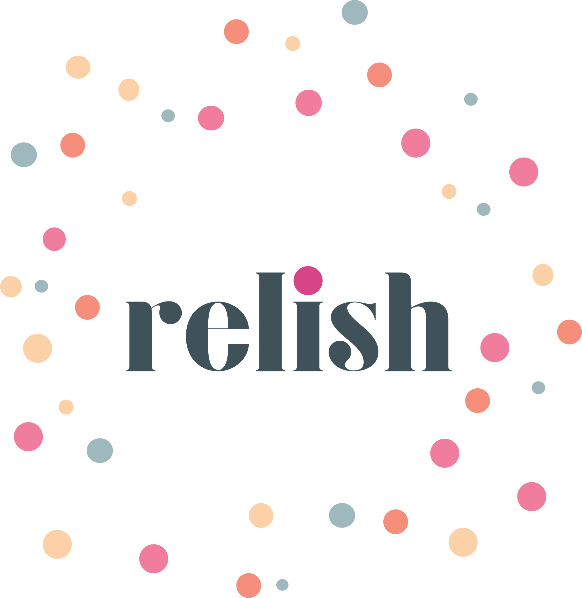
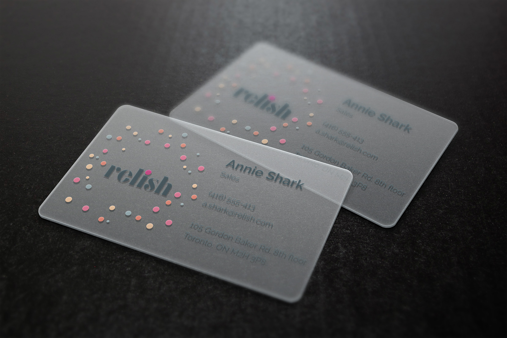
Full Logo
Animated Logo


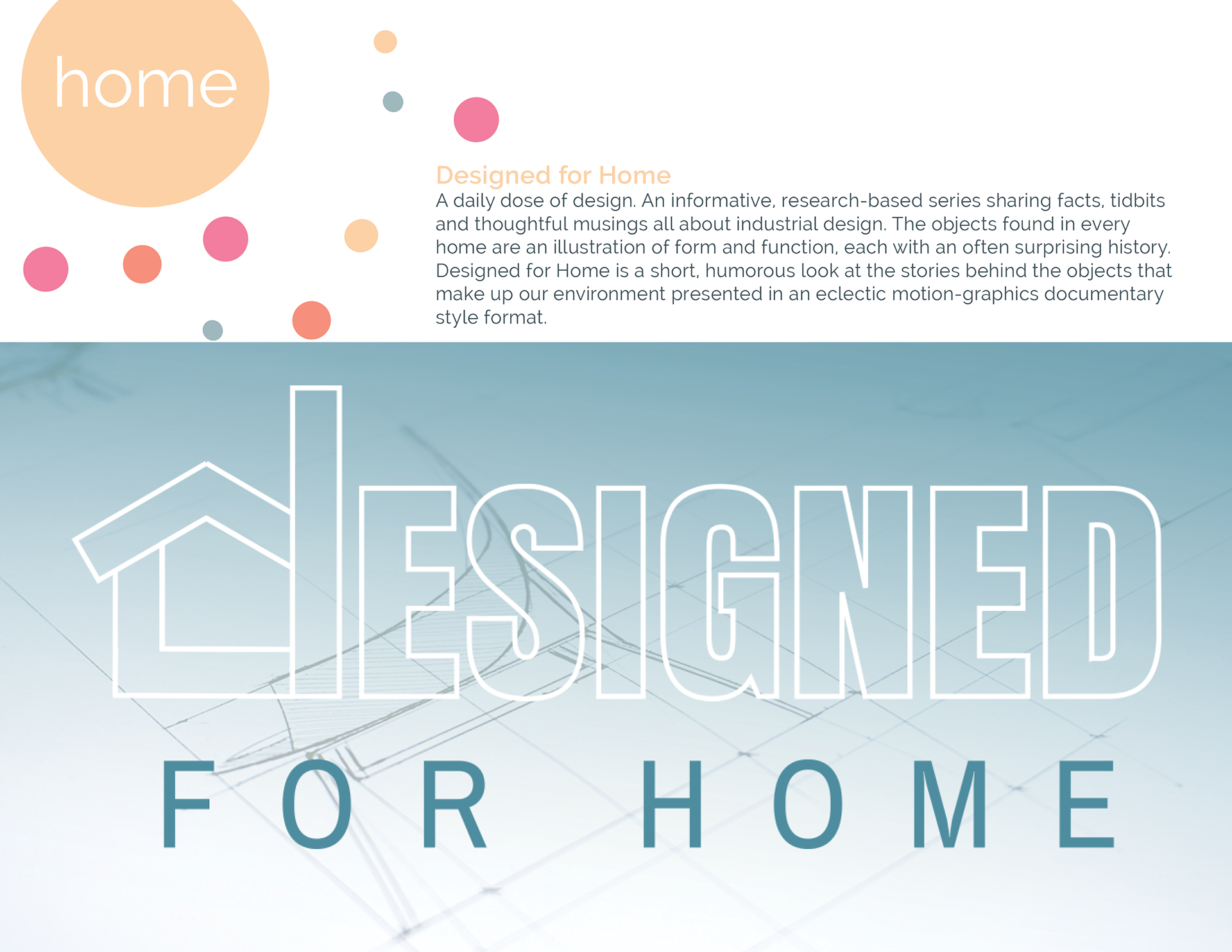
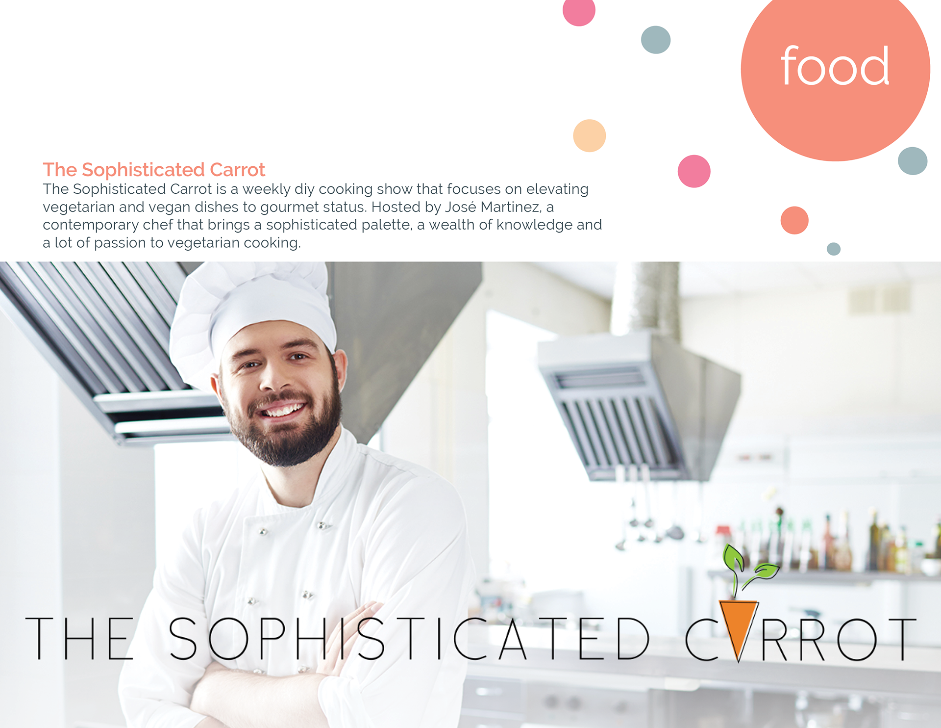
Examples of the Feature Programs as displayed in Brand Standards guide with the different editorial


The brand identity that has been created for Relish epitomizes the brand’s message. It is celebratory, not only in colour, but with the confetti dots surrounding the wordmark. Relish seeks to instill a sense of occasion every day, and what better way than to celebrate and be inspired by your circle of friends. The circle formation is two-fold, it is meant to represent a circle of friends (fashion, food, home and travel), your trusted source of sound advice in these areas. Also the dots in the circular formation are meant to represent one of the brand’s traits - open mindedness.