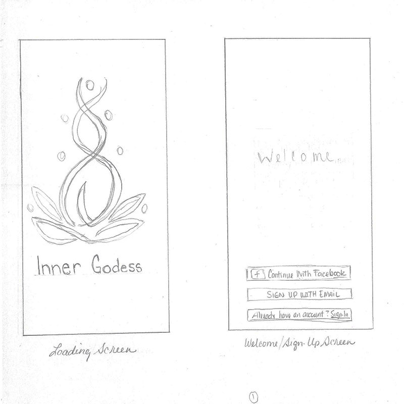

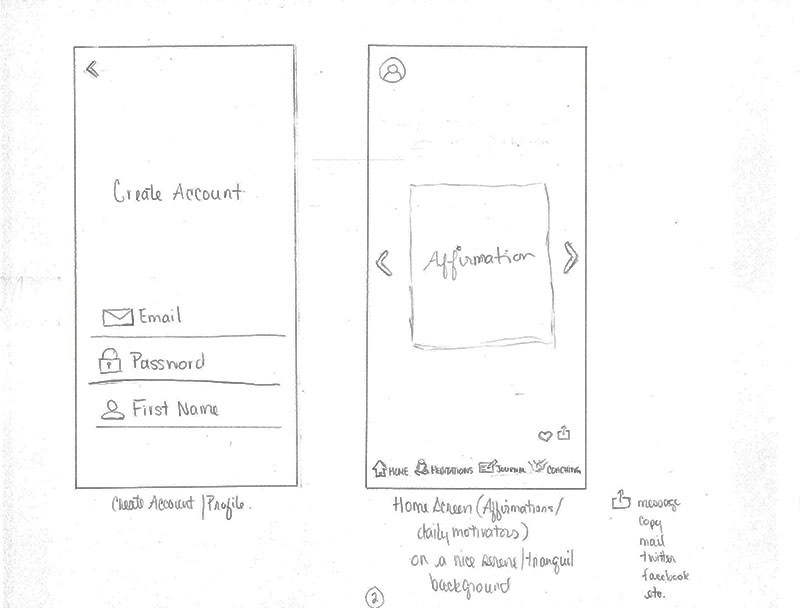
Initial low fidelity sketches

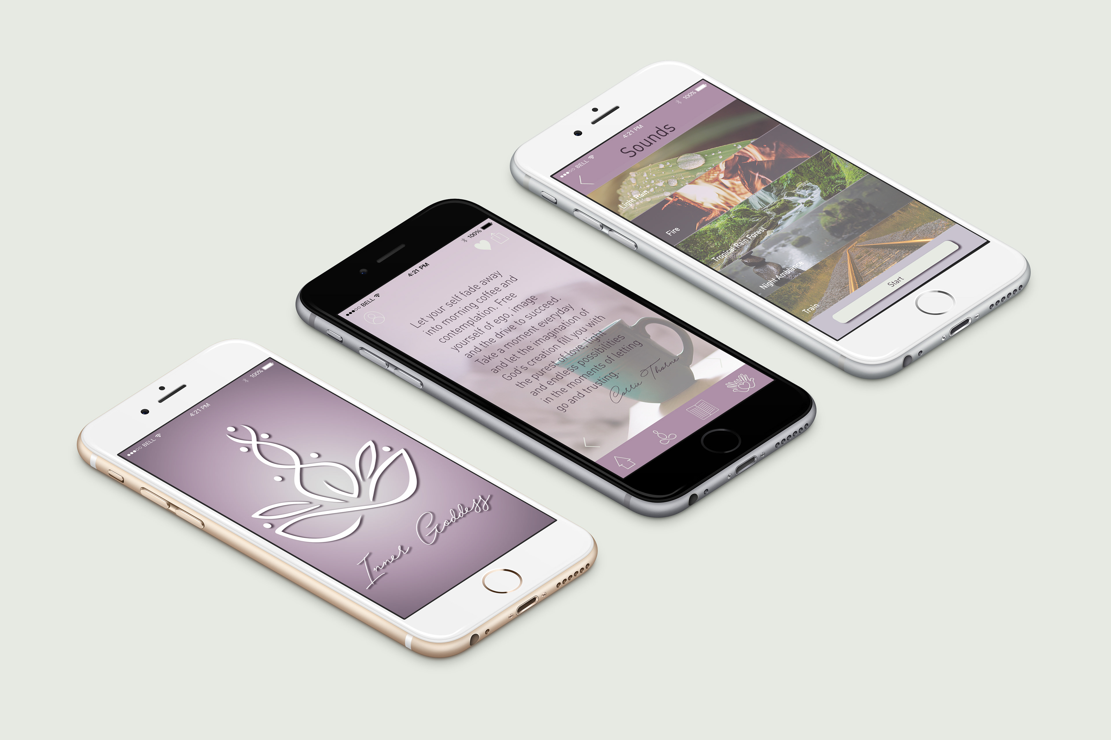
The colours were chosen to represent spiritual awareness and mental healing (purple), strength and self-confidence (grey), and mental clarity (white) that it takes to start the process of finding your Inner Goddess.
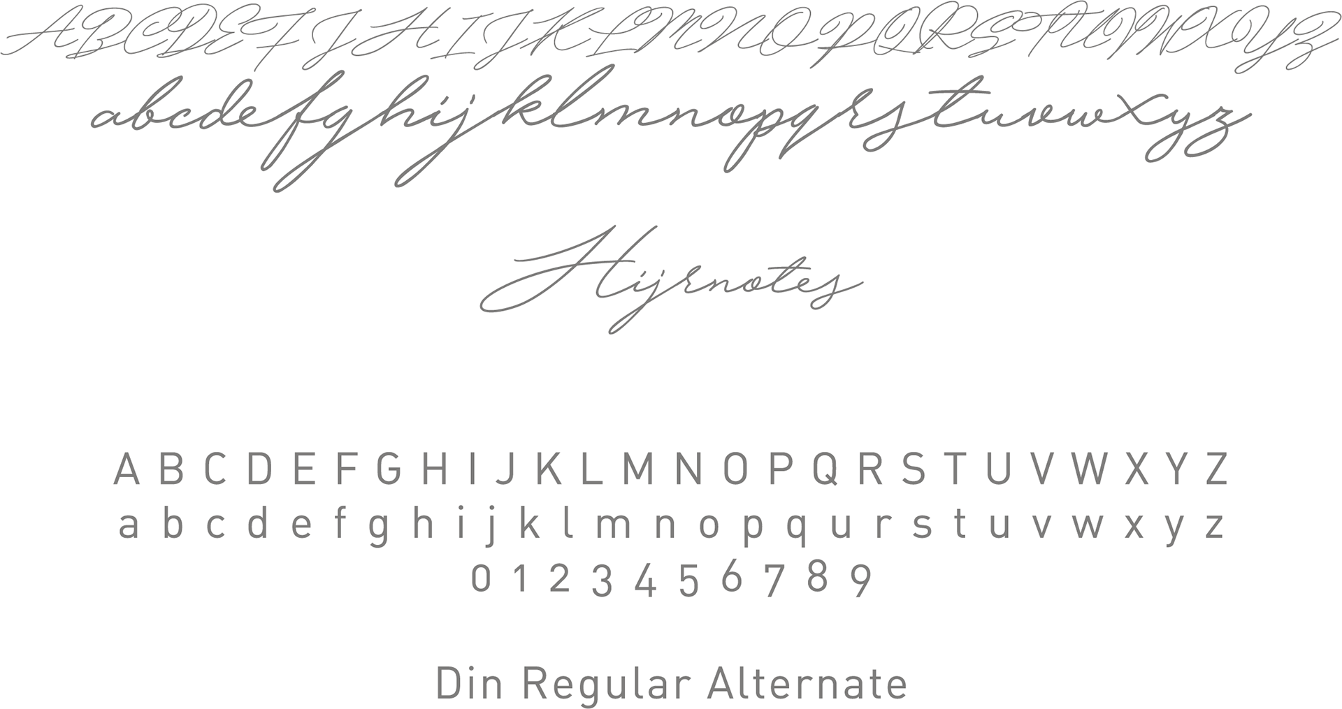
These fonts were chosen to represent femininity and a clean sans serif font for easy readability.

The logo is a female figure emerging from the lotus flower, which has long been known to represent the expanding of the soul and spiritual awakening.